Article: The Hidden Details in the Starbucks Logo
Starbucks is one of the most recognizable brands in the world, and its logo is synonymous with coffee culture. The logo, featuring a two-tailed siren (often referred to as a mermaid), has undergone several redesigns over the years. Each iteration has kept the siren at its center, but there are a few hidden details that are easy to miss.
The History of the Starbucks Logo
When Starbucks was founded in 1971, the company’s founders were inspired by the sea. They wanted a logo that reflected the seafaring history of coffee and Seattle’s strong maritime culture. They discovered a 16th-century Norse woodcut of a twin-tailed mermaid, also known as a siren, which became the basis for the logo.
The siren was chosen because she was alluring, much like coffee, which draws people in with its rich aroma and taste. The idea was that the Starbucks coffee experience was as seductive and irresistible as the siren’s call.
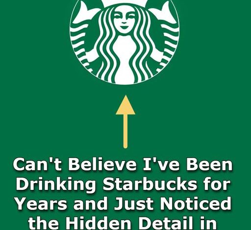
Hidden Details in the Logo
1. **The Asymmetry:**
– One of the most subtle and often overlooked aspects of the Starbucks logo is its intentional asymmetry. If you look closely at the siren’s face, you’ll notice that the left side is slightly different from the right. This asymmetry was introduced in the 2011 redesign to give the siren a more organic, hand-drawn feel, reflecting the imperfections that make us human.
2. **The Crown and Star:**
– The siren is adorned with a crown, which symbolizes her queenly status over the coffee world. The star on the crown is often associated with the celestial navigation used by sailors, tying back to Starbucks’ nautical roots. This star is central to the logo, representing guidance and aspiration.
3. **The Hidden Meaning of the Siren’s Tails:**
– The siren’s two tails are a nod to the original woodcut design, and they represent the company’s connection to the sea. However, they can also be interpreted as a symbol of abundance and duality—two forces that come together to create something enticing and irresistible, much like the blend of flavors in a cup of coffee.
The Evolution of the Logo
Over the years, the Starbucks logo has evolved from a detailed brown and white woodcut-style design to the more simplified and modern green-and-white version we see today. Each change has been carefully considered to maintain the brand’s identity while keeping it fresh and relevant.
– **1971:** The original logo was brown, featuring a detailed siren with bare breasts and a fully visible navel.
– **1987:** The logo was updated to green, with the siren’s breasts covered by her flowing hair.
– **1992:** The logo was further simplified, with a close-up of the siren’s face and her tails framing her like a decorative pattern.
– **2011:** The most recent change removed the “Starbucks Coffee” wordmark, allowing the siren to stand alone as the brand’s symbol.
Conclusion
The Starbucks logo is more than just a symbol; it’s a carefully crafted piece of branding that tells a story of history, culture, and allure. The hidden details, from the asymmetry in the siren’s face to the significance of her twin tails, all contribute to the logo’s depth and enduring appeal. Next time you pick up your coffee, take a moment to appreciate the thought that went into creating this iconic image.